Thursday, December 11, 2014

Site Scouting

One of the things I'm most grateful for in this class is this project in particular.  Not only does it allow me personal creativity room, it also is letting me place a "banner" at a location that I've wanted to cover for nearly 4 years.

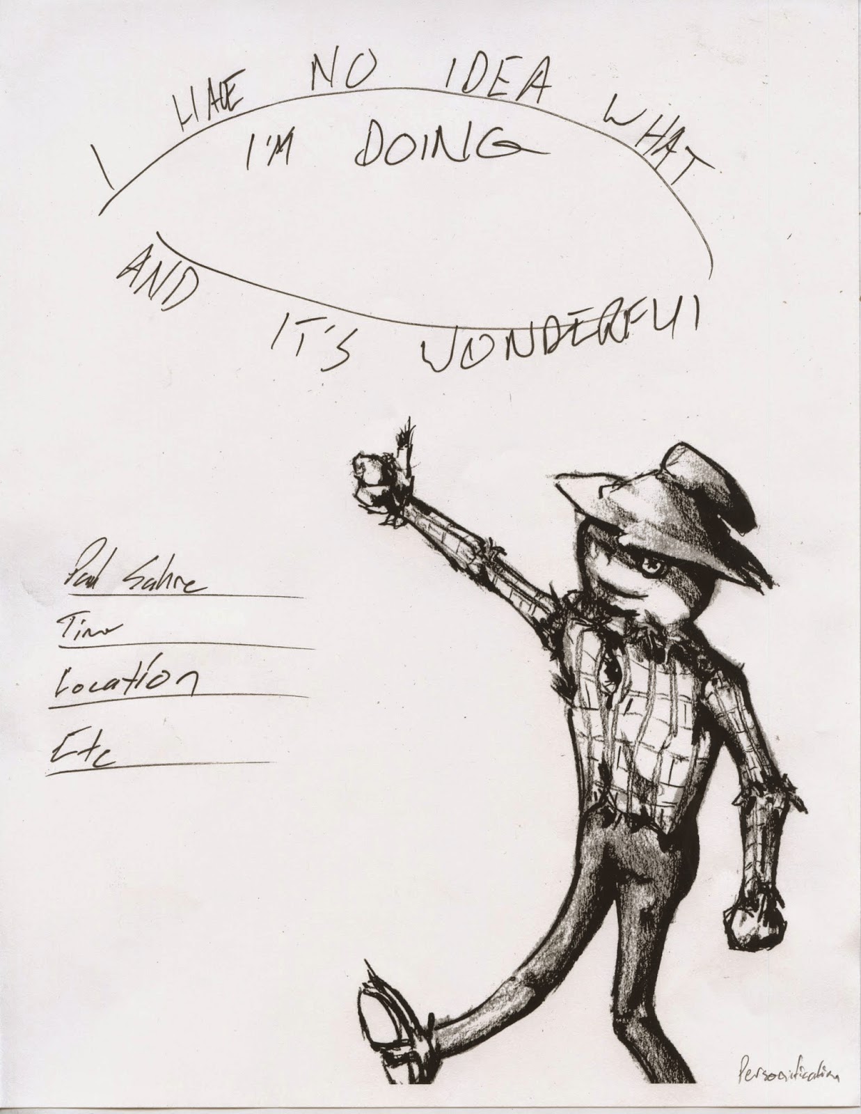
Though I wanted to make a banner, on Budig Hall, that said, "Here Comes Tomorrow," I'm willing to settle for, "I have no idea what I'm doing and it's wonderful."

There was a good point brought up that black and white images wouldn't translate very well on the white-ish stone. So I took a few concept images of how they might look.


These images make me agree that if I do use this wall they must be colored, or have a far stronger contrast than I originally intended.

While taking these shots I became intregued with one of the art and design building's exterior walls, and wondered what my images would look like against a brick wall.


I feel that the red, tan, color of the bricks favors the black and white imagery as opposed to the full colored imagery.  I feel that the Budig wall is far more impressive location for my imagery, but the Art & Design wall fits the audience better. I also think that the colors of the A&D bricks would add to my concept more than the plain white stone.


I still really want to cover that exterior of Budig, but while writing this blog post I've realized that it isn't the better location for this particular project.

Thursday, December 4, 2014

Title Project

While discussing my project, and ideas, in a peer group setting I received interesting responses.  Firstly they correctly argued that my title was obscure and kinda stupid.  They felt I should just use the quote that I was taking inspiration from and use it.

"I have no idea what I'm doing, and its wonderful."

Secondly, I've worked down some of my best ideas down.  I'll update with images of the ideas soon, but for the time being, enjoy one of them colored in a potential color palette idea.


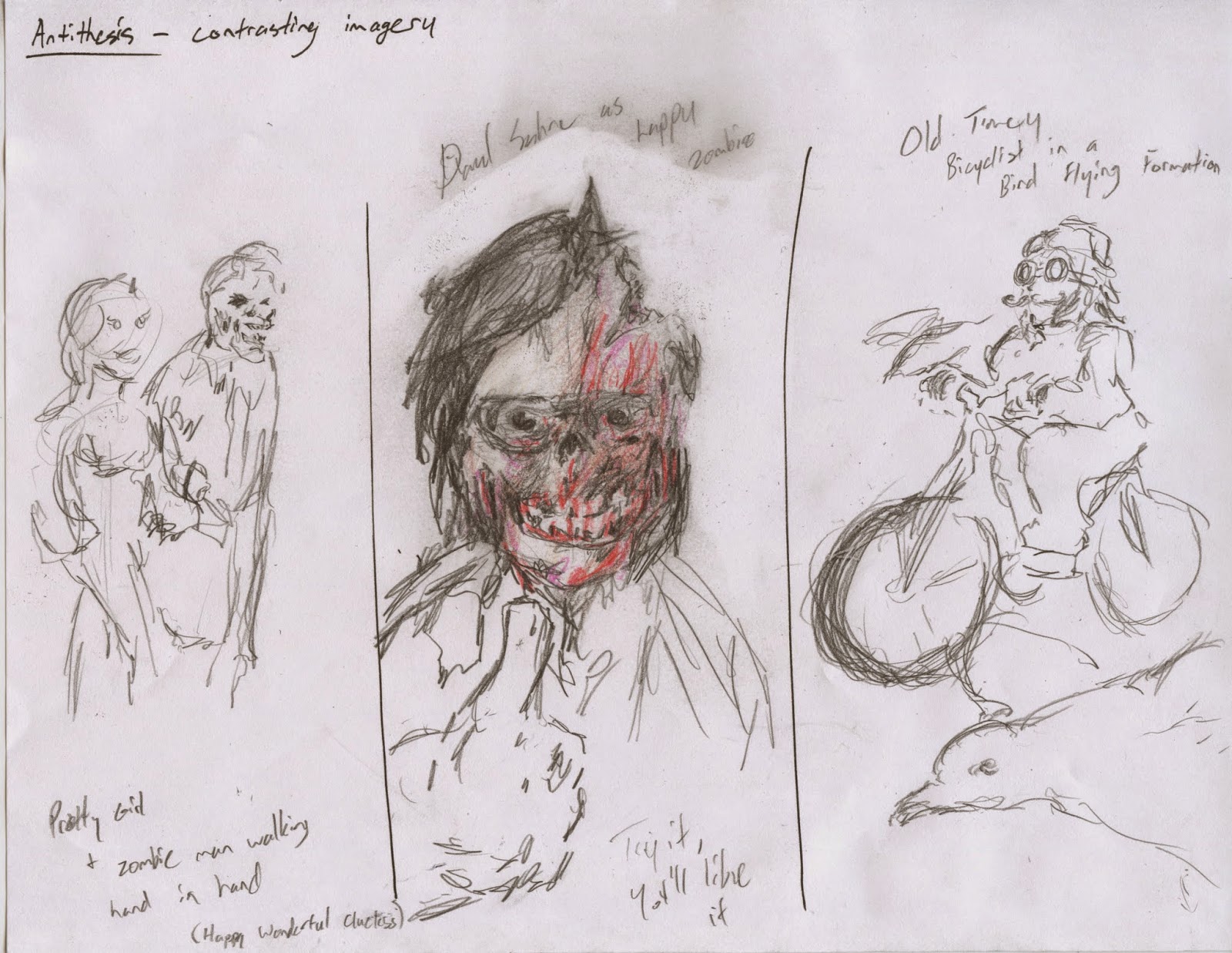
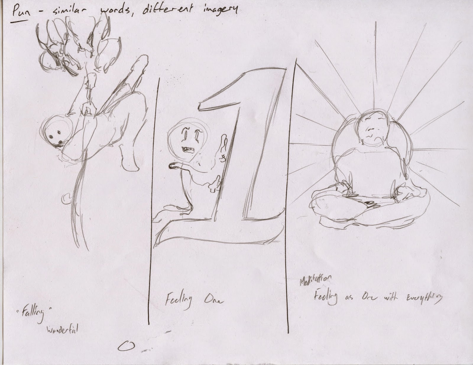
Here are a few initial ideas that I had for the project. Please forgive me for getting the title wrong.


Oddly, I felt that the lightbulb and the image of the man flying a bicycle with a flock of geese were the most interesting, captivating images.

However during a group critique, those images were considered too abstract. They preferred the thinker and scarecrow concepts.  

I'm gonna bite the bullet and design using the bicyclist with the geese despite the group's opinions.  I feel it's abstractness adds to the title of the presentation, and is captivating in a way that feels right to what the presentation would be.


Tuesday, December 2, 2014

Possible Title Designs

So after a quick deliberation, I settled on "Feeling Wonderful with no Idea" as a "promotional" lecture title Paul Sahre might use. It was taken from a quote of him, "I have no idea what I'm doing, and its wonderful."

Using this title as a guide I began to sketch ideas.


Some of my personal favorites of the bunch are: Plotting Charlie Brown, Guy Falling With Balloons,  and the Whistling Broken Lightbulb. 

Tuesday, November 25, 2014

Ideas for Presentation Titles

With my presentation of Paul Sahre I learned quite a lot about the man.  Now I need to figure out an interesting title for him.  The first idea I had was to use one of his quotes as inspiration.  Then, 
using my presentation as a guide I wrote down key words that would describe the 
type of presentation he might give.

"I have no idea what I'm doing, and it's wonderful."

Minimalist   Invisible   Reimaginated  Text  Repurposing  Absurd  Modern


IDEA #1
Feeling Wonderful With No Idea

IDEA #2
The Invisible Absurd Style of Paul Sahre

IDEA #3
Slightly Minimalist, Modern Repurposing

With ideas 2 & 3 I thought of some imagery that would go along with the titles. Idea #3 would 
use the toothbrush from Leisurama; a simple image of a toothbrush that represents weird modern culture.

With Idea #2 I felt it would be cool to use Sahre's epic sideburns and glasses as a minimalist silhouette.  I really like this concept because it shows aspects of his art style, while also giving an image to think on.  

I find the abstract portrait interesting as it lets the viewer quickly see his physical features as well.
But I guess the design could be used for any of the potential titles.


Tuesday, November 11, 2014

Describing Paul Sahre

Looking over my research notes on the designer Paul Sahre I found a few simple, 
describing words for his style.

Primarily Works with Book Covers
Some CD Covers
Classically Implied
Abstract
Minimalist
Modern Absurdity
Invisibly Designed

In one of the interviews I read, he felt disappointed in his work if people could identify an 
individual style in his work.The works of his that I already own are tribute works for other 
artists and his beliefs for invisible design are likely the reason for it.  

His approach was to highlight the original works without designing something that altered 
the feeling of the original work.

Examples of his work starting with the two I personally own, Kirby, King of Comics 
and Maximum FF.


Thursday, November 6, 2014

Assigned Designer

So I've been assigned to present Paul Sahre to the class, via presentation.  After doing very simple research on the guy I found that I enjoy some of his work and personality.

As a matter of fact I own one of his projects. 

Go figure.

Tuesday, November 4, 2014

Final Contact Designs

After a few tweaks these are my final designs for a resume and business cards.
    
By leaving spaces on my cards, I can let my art speak for me.

EDIT: After spending an hour or so looking at the resume, I noticed a few typos and many graphical errors that I missed.  Certain alignments went unnoticed and some ideas never made it into the page while I was working on it.

It just goes to show that work is never truly finished.