Friday, May 2, 2014

New Works Besides Book Making

Here are a few of my better drawings and ideas from the resent weeks that are not specifically a part of any book design process.

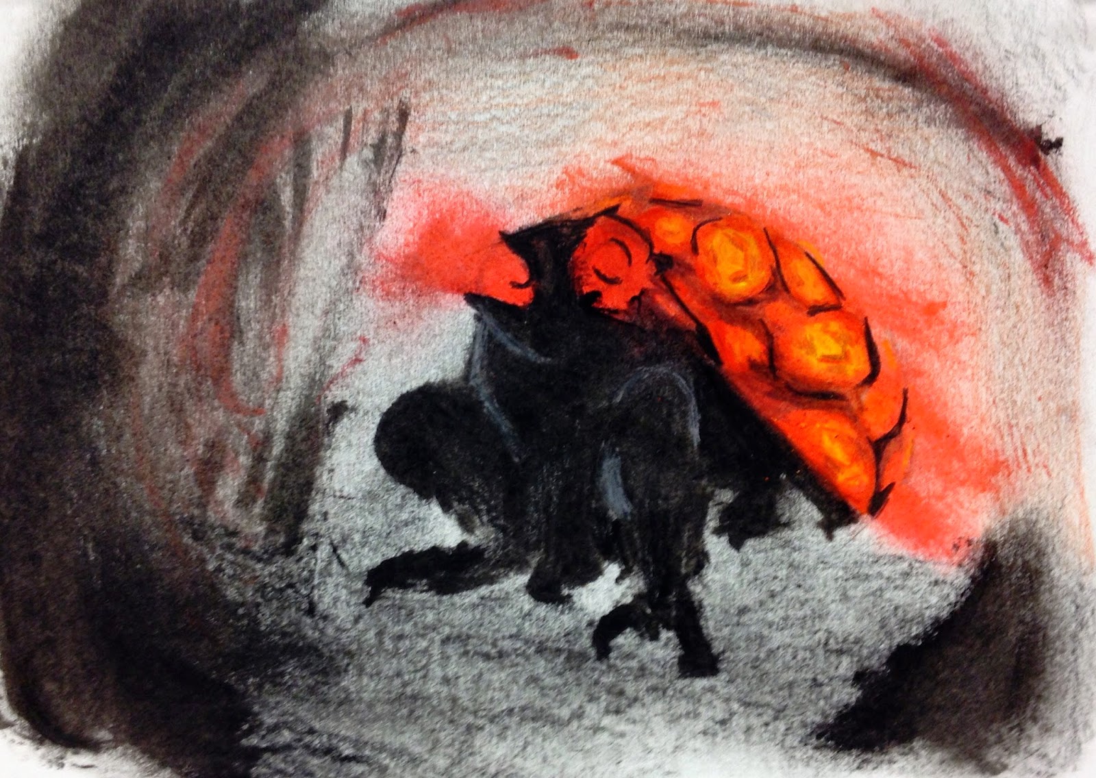
From Illustration class I have two imaginary creatures to share.  One is a sky whale, which is part of my final project concept for the class.  And the other is a Strong Toad, based on a description read aloud.


Then from Life Drawing class I have my latest work.  I am particularly proud of this piece because I was actively attempting to knowledge the criticism I revived during a portfolio review.  My instructor felt that my marks were too erratic in regards to the overall composition of the piece.  They felt I needed to work slower and more deliberately, attempting to make an image that feels unified throughout the page.  


Lastly, I have another update for the landscape painting I am working on.  I really intended,when I sat down to work on this, that I was going to finish it.  However, it still needs at least one more sitting before I think its finished.


Mid-Process Concepts


So here are a few spreads for the book project.  This first image is very, nearly my final design for my specific four pages.  I might have a few issues with the legibility of the white font, so I went through and set all of the text to bold face.  I'll have to try printing it and see what it looks like. 


These next two sets of pages are slightly less as far along, however they are also closer to being done as opposed to not.  I have already made a few minor tweaks to the second set, the table of contents pages.  Though the purpose of the pages might be self explanatory, I felt I should error on the side of caution and identify the pages as the table of contents.  I lowered the four images, added a bar across the top that mirrors that bar across the bottom of the images, and added "Table of Contents" in a similar font as I used for each illustrator.


Lastly I have two mid-concept cover ideas to show.  Though I enjoy the blue sky cover concept, I have already decided to use it for the title page of the book.  I think it might be too repetitious, too quickly in one short book.  So that leaves me with the swirling ink design.  I like the concept, but something just does not feel "right" about the design.  


Also as a note, even though we were encouraged not to have any text on the spine of the jacket, I went ahead and did anyway.  The reason for this is because I have created over 100 different DVD case covers, each of those with a legible spine.  I feel that the concept for the spine of a book jacket and DVD slip insert is relatively the same thing.