Sunday, December 15, 2013

Random Photo I Took

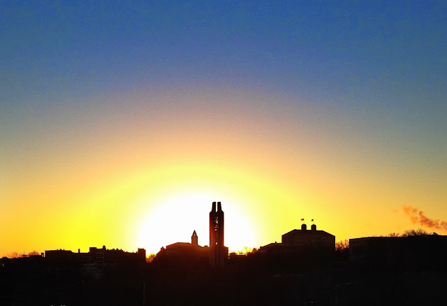
Early one morning as we arrived in Lawrence my sister thought that a sunrise was particularly beautiful.  So I took a photo of it.

 I thought it was a interesting photo.

When I had some free time during the day I used the Snapseed photo editor on my phone to see if I could make the image more dramatic.


I really like the way over saturation of the colors pop behind the dark black skyline.


Paper Lantern Final Model Photos


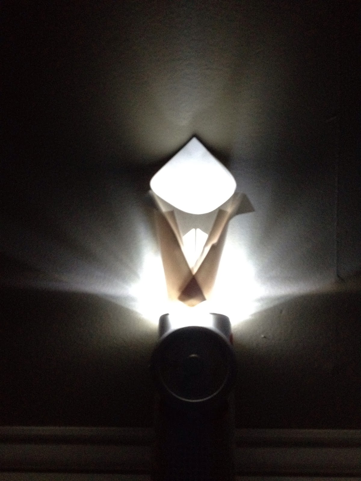
I really think the final design is particularly strong.  I specifically choose a bright bulb so that any imperfections I did make were better hidden.  


Though the lantern does look rather plain when exposed to natural light.

Thursday, December 5, 2013

Paper Lantern Models

Recently a paper lantern project has been taking up a good share of my time.  Here are a few of the later models of mine.


The first three models are all variations of the four point star fold.  I feel that the final model is the strongest variation of the three.  Though the model is unfinished, the final concept is for the model to be a circular shape.


The next group of models are unified with a color theme.  I splashed cologne on the paper so that the paper glows a unique shade.  I really feel the first is a strong concept.  If I were to continue with some of these concepts, I would combine the first style with the third style.


 These final models are built with a flowering bud concept as inspiration. The second model might be my favorite with the way it diffuses light.  But the longer I look at the third version my appreciation of it grows.


Thursday, November 28, 2013

Evolution of a Painting


In my free time I tend to paint.  My mother found a photo that she liked, and she offered supplies for painting it.  Slowly its been progressing, but I find the evolution of a painting just as interesting as the final image.  Sort of like a flip-book, the painting has energy in each stage.


 Each level focuses on one specific detail of the landscape. 
 First the sky and water, then background working into the foreground.


 I'm not entirely happy with the trees in the foreground, but the rock formation looks fantastic.
I think the person in the boat distracts from the overall image, so I don't expect they will make it into the painting.

48"x36" oil on canvas
 

Monday, November 25, 2013

Migrate - Accordion Book (Models and Final Design)

Some inspirational models that I mocked up for the word migrate.


 These models show the ideas that I would incorporate into the final book.  I took the rotating reading pages and the animal movement from the upper book.  And I took the dark to light color idea I envisioned for the lower book.

I feel the book has a simple look to it.  It uses no color besides the photos while maintaining a slow transition from black to grey backgrounds.


BDS Process Book 003

After spending soo much time on the last process book I figure I might as well share part of it.  I happen to be very proud of the layout for this particular book.  I used the letters "s" and "u" to create an image that feels like a fleur-de-lis.


The only problem I had with my book was with printing the book.  I took it to Jayhawk Ink to print.  I decided that I wanted to print double sided and I wanted to trim the bleed. Instead of cutting the bleed by hand on every page, Jayhawk Ink could do it quickly with a machine.  

Their machine was broken and they dragged me on all day telling me that it was going to be fixed.  They ended up charging me $13 for printing that I could have done for $5. 

Hallmark Lecture - Gary Locke

I felt that Gary Locke was very interesting to listen to.  Particularly his advise on not being too much of a know-it-all.  As someone who does tend to be too loud and opinionated this is good advise.  However this seemed to contradict with Gary's work.  A good portion of his work tends to be for super opinionated groups,  so his revised message might be to work for people you won't offend easily.

Recent Works

It's been a little while sense my last post.  These are a few of the projects that were keeping me busy.

This painting is a work in progress.  It is intended to be a graduation present for my sister.  Done on a 2'x3' canvas with oil paint.  I'm nearly at the finish line for it though. Just a little more work...

 A stick and ink drawing of the natural history museum building on KU campus.  I feel the simple lines really add to the drawing.

 A pencil drawing of the interior of a mouth.    The way the teeth of the lower jaw trail off lends a scope of depth to the piece.

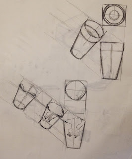
 A few experiments with linear perspective.  Nothing too noteworthy otherwise.

 I wondered what a lamp would look like if it were made of woven wood.  Using led bulbs in side the woven holes the lamp has an otherworldly presence.  I also thought that light in fruit-like bulbs would be interesting to see.

 Over the summer I acquired an old beer keg.  I was really interested in the round metallic structure of the keg and wanted to make a lamp out of it.  I drew this quick sketch the same day of the wood-like lamp.  The lamp became a flowing sudo-victorian streetlamp design.  I really enjoy the small rounded globes midway up the post, they feel similar to street signal lights.

I took this picture in front of spencer art museum a week or so ago.  The flower beds had been covered in blue stones of various hues, before fall began.  As fall approached, the leaves turned a brilliant shade of red.  The day the leaves finally fell the red leaves blanketed the blue stones.  I felt the image was very compelling.  The photo was later edited to increase the saturation of color for even greater contrasts. 

This is another stick and ink style drawing.  It was done using a Noguchi sculpture, found in the Nelson-Atkins, as the subject matter.  I feel the bold lines showing shadow and the light, some non-existant, lines are very effective.  I am very happy with this particular piece.

Friday, October 11, 2013

Drawing Tonka Trucks

Using two different Tonka trucks my drawing class was given the assignment to draw three images per page. With those guidelines I attempted to make each drawing in a different style; charcoal, pencil, a combination of the two even drawing only shadow detail. I felt they turned out really well.


Bad Design Skteches

Here are 15 sketches of badly designed objects. They are a pill fob, a thumbtack and a plastic eraser.


Here are 15 designs for the group project redesign. 

Might as well end this post with a quick example storyboard.


Drawing Class Sketches and a Few Random Ones.


So the first few sketches are done for the purpose of defining space of an object.


These charcoal sketches were done attempting to focus on the negative space of random objects. (The sketch on the left was started by me, later added to during class by a classmate.)


These next two sketches are done as a shape experiment.  One is a rotating clothespin, and the other is a hybrid clothespin with a binder clip.  
Lastly are just a few sketches; a European castle, a ocean seascape, and a flying Jayhawk.