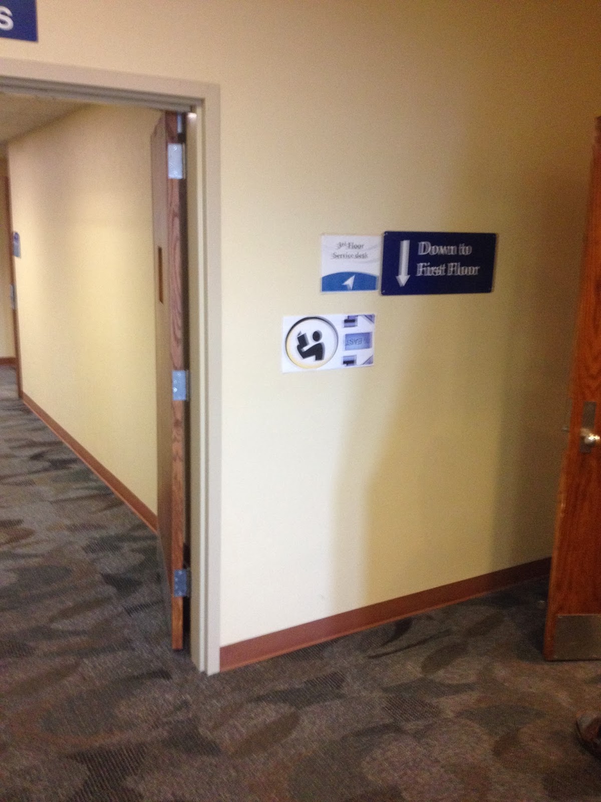
Figured I should post a few quick early signage, and logos, for the BDS wayfinding project. Every aspect of these images should not be considered final. They were attempts for judging color and positioning for various signs.


The blue design meshed better with the already existing signage that the library had.
The yellow markers were far more engaging to the eye however. Though there are already many arrows in the same locations as our signs would be located at, they are not very engaging with the viewer.
Maybe we should consider looking at how we should change the existing signage instead of creating our own?


No comments:
Post a Comment