Friday, May 2, 2014

New Works Besides Book Making

Here are a few of my better drawings and ideas from the resent weeks that are not specifically a part of any book design process.
From Illustration class I have two imaginary creatures to share.  One is a sky whale, which is part of my final project concept for the class.  And the other is a Strong Toad, based on a description read aloud.


Then from Life Drawing class I have my latest work.  I am particularly proud of this piece because I was actively attempting to knowledge the criticism I revived during a portfolio review.  My instructor felt that my marks were too erratic in regards to the overall composition of the piece.  They felt I needed to work slower and more deliberately, attempting to make an image that feels unified throughout the page.  


Lastly, I have another update for the landscape painting I am working on.  I really intended,when I sat down to work on this, that I was going to finish it.  However, it still needs at least one more sitting before I think its finished.


Mid-Process Concepts


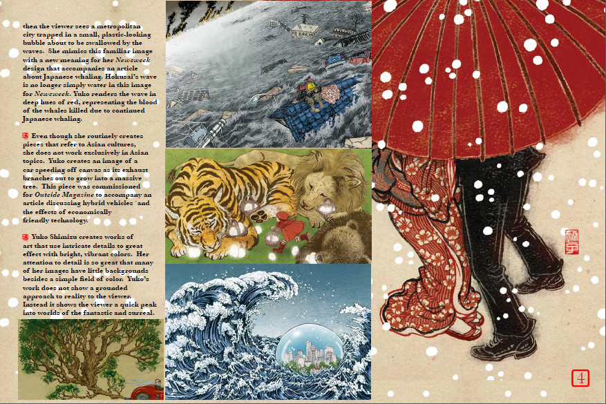
So here are a few spreads for the book project.  This first image is very, nearly my final design for my specific four pages.  I might have a few issues with the legibility of the white font, so I went through and set all of the text to bold face.  I'll have to try printing it and see what it looks like. 


These next two sets of pages are slightly less as far along, however they are also closer to being done as opposed to not.  I have already made a few minor tweaks to the second set, the table of contents pages.  Though the purpose of the pages might be self explanatory, I felt I should error on the side of caution and identify the pages as the table of contents.  I lowered the four images, added a bar across the top that mirrors that bar across the bottom of the images, and added "Table of Contents" in a similar font as I used for each illustrator.


Lastly I have two mid-concept cover ideas to show.  Though I enjoy the blue sky cover concept, I have already decided to use it for the title page of the book.  I think it might be too repetitious, too quickly in one short book.  So that leaves me with the swirling ink design.  I like the concept, but something just does not feel "right" about the design.  


Also as a note, even though we were encouraged not to have any text on the spine of the jacket, I went ahead and did anyway.  The reason for this is because I have created over 100 different DVD case covers, each of those with a legible spine.  I feel that the concept for the spine of a book jacket and DVD slip insert is relatively the same thing. 

Thursday, April 24, 2014

Working On Concepts

The closer I get to the final due date for the designer book the closer I seem to be getting to being finished with it.  Honestly, the greatest challenge for me at this point is the background.  I need to experiment with a few different background imagery styles to find something that is simple to read off of and interesting enough to control the viewer's eye across blank space.  I seem to be stuck in a middle ground between the two currently, but I should be able to think of something by the end of the weekend.

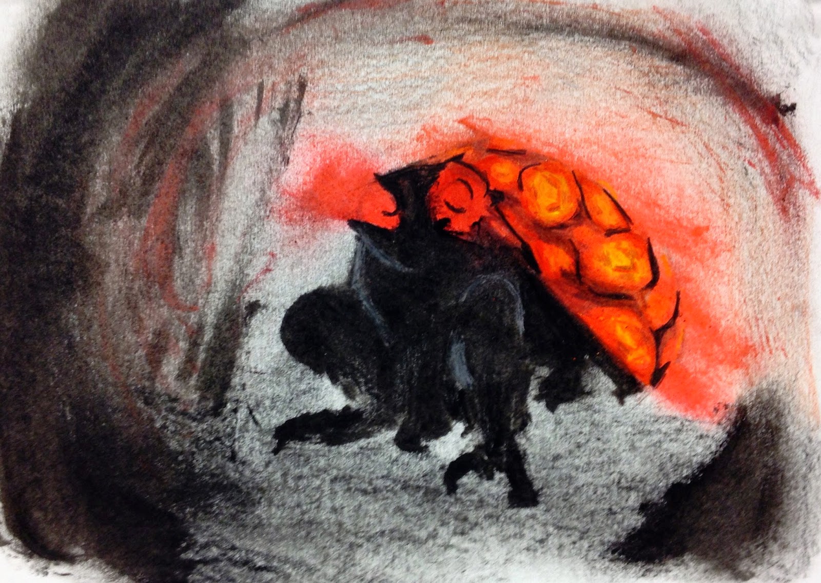
As a bonus here is an image I created during the day today.  An imaginary animal was described out loud and we were asked to show it on a page.  

The animal seems like a toad with a turtle's shell on its back.  Also the toad glows like a firefly and its gaze is deadly.  

Wednesday, April 23, 2014

Created an interesting publisher mark

One of my favorite conceptual ideas is the idea of the world tree.  This theory is based on an idea that all reality is contained within a single tree.  What makes the idea more interesting is that many different cultures use similar imagery of the world tree.

Here is the original image that I drew. Beside it, an altered design that plays on the world as part of the tree concept literally. 

Monday, April 14, 2014

So..... New Project, New Issues

So the new project is to design 2 two page spreads on a designer of our choosing.  No problem. One of the side projects for last semester was to look at the same list and give a quick presentation over one of them.  Though I love Alphonse Mucha and could have easily do another presentation on him I choose to go with my secondary choice from last time, Yuko Shimizu.

As someone very influenced by asian culture myself it is appropriate to look at another designer who uses similar themes.


Now to get to the new problem plaguing the project.  This morning, after spending some of the time last week working on the design for the spread I lost all of my files.

All of my biography text needs to be retyped, images taken off the internet again, and designs for page spreads to be rebuilt. Before I can sleep tonight. So that I can have them ready for tomorrow.


Wish me luck! 


(This situation really makes me think of the Japanese phrase for good luck. Literally translated into English, the Japanese saying is "Suffer through it!" Seems appropriate.)

(UPDATE)

Posting a mid-reworking concept page. The upper paragraph is too busy, but the solid field of blue seems to work fairly well.  


Thursday, March 27, 2014

Enlightening Trip to the Museum

A few photography examples really inspired me while at the Spencer Art Museum.  

I felt the repetitive imagery of Jeff Brouws' Twelve Drive-Ins very effective.

The images that attempted to find locations of other images from decades before were also quite effective. Such as Andrew Joseph Russel's Hanging Rock, foot of Echo Canyon and Rick Dingus' similarly named photo.  The contrast between monochrome images and color was also very striking and I was inspired to incorporate it into my own project.

And while somewhat on topic, I've been attempting to edit some aspects of an earlier photo from this year.  I feel that by reducing the glare of the sun and over saturating the red of the image really makes the photo beautiful.

Tuesday, March 25, 2014

Editing in Photoshop

While playing around in photoshop I ended up with this image.  I rather enjoy the way the sharp points meet with soft curves and how the colors seem to shatter.