Wednesday, September 3, 2014

Recent Works


During the summer I continued working on model drawings. 

Though I did not have live models, I found a decent collection of photos on the internet to work from. These two are the best results.

I also took sometime to finally update the custom Beatles album cover that I made a few years ago.

I retained the same basic imagery of the original cover, I simply used better techniques for drawing and coloring it.

The first image is a starting scan of my new drawing, and the other images that follow are color experimentation before settling on a design.



The negative color contrast on the blue/yellow cover was too unique, too visually appealing, to me to forget about it entirely.  I think the colors recall the imagery used to promote the "Yellow Submarine" movie. Though I settled on the the yellowed, last image, it was a hard choice not to use the negative color image.  

Presentation of Visual Communication

While debating the medium of visualization communication I came to the conclusion that it was anything that could be viewed as altered by human means.

So I began to make a quick comparison chart, with flowers as an example.
Wildly growing flowers, not visual communication.

Bouquets of flowers, a garden full of flowers, new breeds of flowers, importing exotic 
flowers, watering flowers, even scattering seeds into the wind to see if they grow could 
be considered visual communication.

While debating the issue mentally, I began to think of the Flint Hills and where it may fall on being visual communication or not.  Initially, I felt no they were not visual communication, they were simply wild fields.  Wild fields that were purposely untouched.

That last statement made me realized that even the lack of human interaction was interaction, if the purpose of in-action was to preserve the object as it was.  Arguably the visual communication 
given by the Flint Hills was that it was worth protecting.  

Anything that has, or could have been, affected by humanity is some sort of visual communication.
As long as someone, anyone, made a decision to affect something, or not, they have 
communicated this intent to whoever views the outcome.

Maybe I should just come in wearing black sunglasses to demonstrate the only way not to be effected by visual communication.  But that might only work if everyone else was wearing them too?


Friday, May 2, 2014

New Works Besides Book Making

Here are a few of my better drawings and ideas from the resent weeks that are not specifically a part of any book design process.

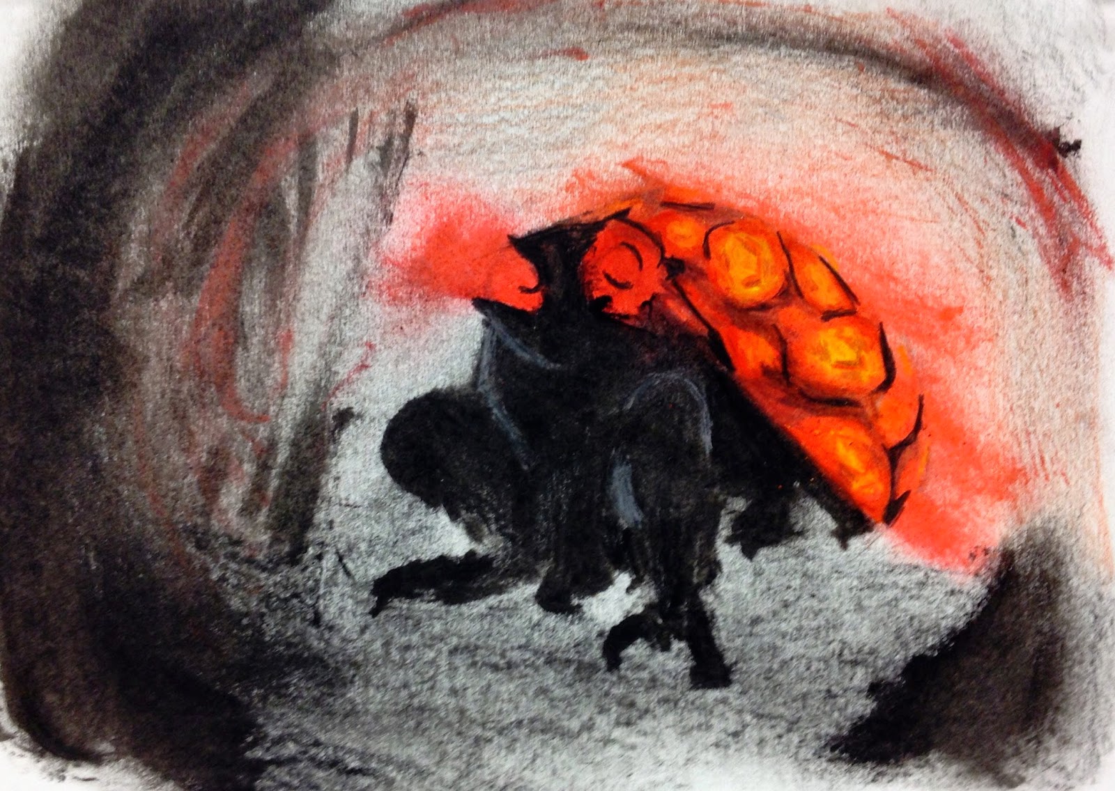
From Illustration class I have two imaginary creatures to share.  One is a sky whale, which is part of my final project concept for the class.  And the other is a Strong Toad, based on a description read aloud.


Then from Life Drawing class I have my latest work.  I am particularly proud of this piece because I was actively attempting to knowledge the criticism I revived during a portfolio review.  My instructor felt that my marks were too erratic in regards to the overall composition of the piece.  They felt I needed to work slower and more deliberately, attempting to make an image that feels unified throughout the page.  


Lastly, I have another update for the landscape painting I am working on.  I really intended,when I sat down to work on this, that I was going to finish it.  However, it still needs at least one more sitting before I think its finished.


Mid-Process Concepts


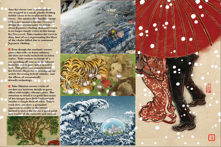
So here are a few spreads for the book project.  This first image is very, nearly my final design for my specific four pages.  I might have a few issues with the legibility of the white font, so I went through and set all of the text to bold face.  I'll have to try printing it and see what it looks like. 


These next two sets of pages are slightly less as far along, however they are also closer to being done as opposed to not.  I have already made a few minor tweaks to the second set, the table of contents pages.  Though the purpose of the pages might be self explanatory, I felt I should error on the side of caution and identify the pages as the table of contents.  I lowered the four images, added a bar across the top that mirrors that bar across the bottom of the images, and added "Table of Contents" in a similar font as I used for each illustrator.


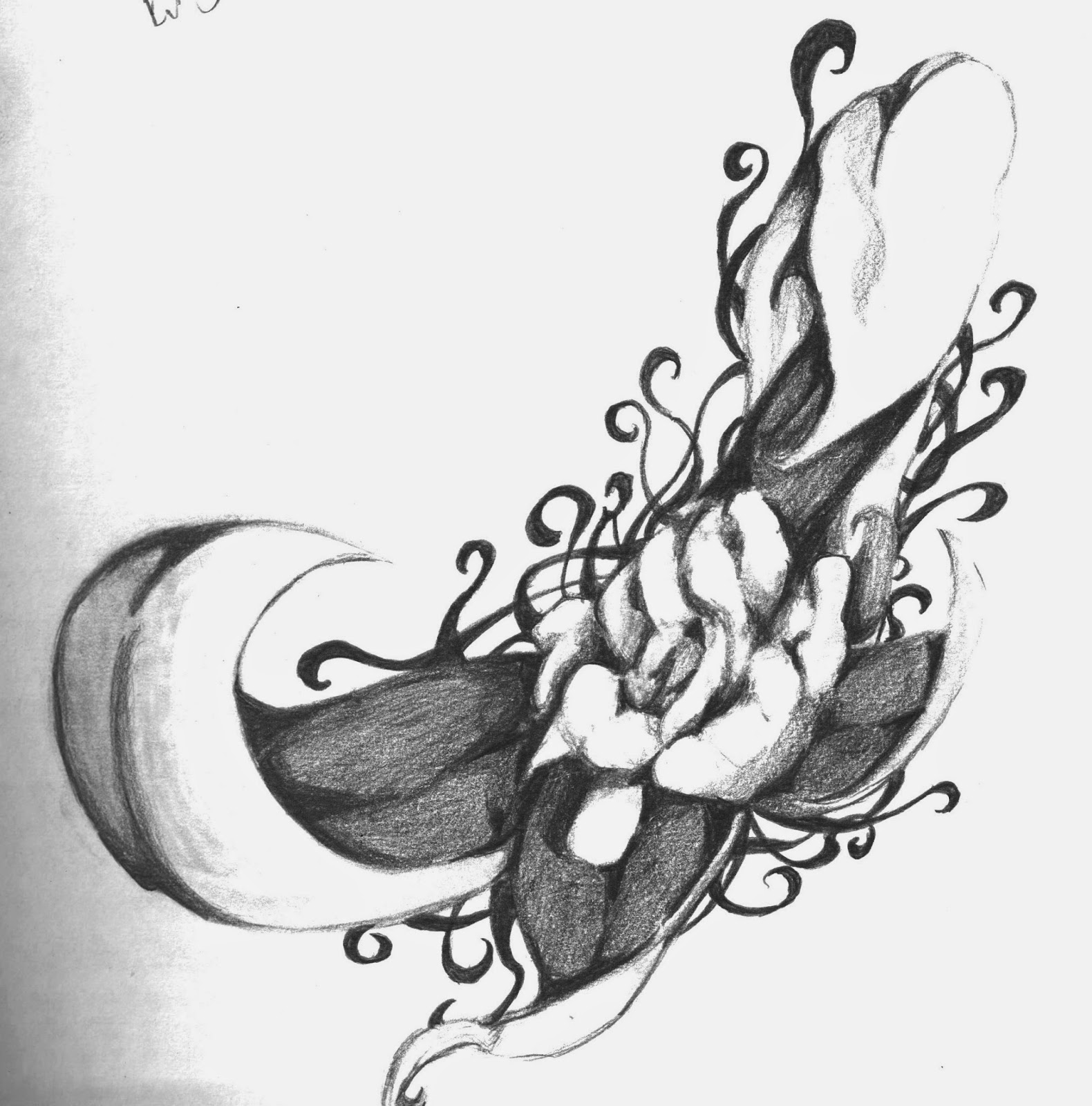
Lastly I have two mid-concept cover ideas to show.  Though I enjoy the blue sky cover concept, I have already decided to use it for the title page of the book.  I think it might be too repetitious, too quickly in one short book.  So that leaves me with the swirling ink design.  I like the concept, but something just does not feel "right" about the design.  


Also as a note, even though we were encouraged not to have any text on the spine of the jacket, I went ahead and did anyway.  The reason for this is because I have created over 100 different DVD case covers, each of those with a legible spine.  I feel that the concept for the spine of a book jacket and DVD slip insert is relatively the same thing. 

Thursday, April 24, 2014

Working On Concepts

The closer I get to the final due date for the designer book the closer I seem to be getting to being finished with it.  Honestly, the greatest challenge for me at this point is the background.  I need to experiment with a few different background imagery styles to find something that is simple to read off of and interesting enough to control the viewer's eye across blank space.  I seem to be stuck in a middle ground between the two currently, but I should be able to think of something by the end of the weekend.

As a bonus here is an image I created during the day today.  An imaginary animal was described out loud and we were asked to show it on a page.  

The animal seems like a toad with a turtle's shell on its back.  Also the toad glows like a firefly and its gaze is deadly.  

Wednesday, April 23, 2014

Created an interesting publisher mark

One of my favorite conceptual ideas is the idea of the world tree.  This theory is based on an idea that all reality is contained within a single tree.  What makes the idea more interesting is that many different cultures use similar imagery of the world tree.

Here is the original image that I drew. Beside it, an altered design that plays on the world as part of the tree concept literally. 

Monday, April 14, 2014

So..... New Project, New Issues

So the new project is to design 2 two page spreads on a designer of our choosing.  No problem. One of the side projects for last semester was to look at the same list and give a quick presentation over one of them.  Though I love Alphonse Mucha and could have easily do another presentation on him I choose to go with my secondary choice from last time, Yuko Shimizu.

As someone very influenced by asian culture myself it is appropriate to look at another designer who uses similar themes.


Now to get to the new problem plaguing the project.  This morning, after spending some of the time last week working on the design for the spread I lost all of my files.

All of my biography text needs to be retyped, images taken off the internet again, and designs for page spreads to be rebuilt. Before I can sleep tonight. So that I can have them ready for tomorrow.


Wish me luck! 


(This situation really makes me think of the Japanese phrase for good luck. Literally translated into English, the Japanese saying is "Suffer through it!" Seems appropriate.)

(UPDATE)

Posting a mid-reworking concept page. The upper paragraph is too busy, but the solid field of blue seems to work fairly well.