Sunday, October 2, 2016

Old Projects (4)

These are the later projects of Junior year, concept art class.


These pieces are the self as animal and the animate inanimate object projects.  I rendered myself as an owl using photoshop. My animate object is a usb cable, rendered using acrylic paint with digital touchups. 
This project is the insect vehicle project.


These 4 images are the reinterpreting a classic story in a new way project.  I used the story Aladdin and chose to show the story through the lens of a giant robot anime. In retrospect I should have done a character model page for Aladdin instead of the wizard, Maghreb.

Marvin the Martin image is my piece for the pinup project.  The purpose of the project is to mimic another style very closely, while showing the character in a pose they normally would not be seen in.


These final pieces are the nursery rhyme as crime noir project. My rhyme was ladybug, ladybug.  I created this piece digitally, so I experimented with horizontal and vertical orientation as I worked.  I submitted the vertical piece as the final.

Old Projects (3)

These projects were from the beginning of Junior year. Barry Fitzgerald was the teacher.


My submission for the christmas card c


My pieces for representing 5 different styles.  This was the first project I felt that the class was really able to experiment with creativity.


 These 3 images represent my works for the emotion project, I used anger.  I do not feel that these ended up being very successful.


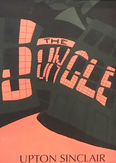
The image I submitted for the banned book assignment, and the image I submitted to the public library as my entry for the banned book contest.


Infographic assignment, shows the percentage of gdp of western nations on education spending. 


New York Times black and white editorial image assignment.  Article deals with the costs of soda.

Final project for this semester, this is the Man-Woman-Bird-Dog-Banana project.  This was another project that allowed for creative solutions.

Old Projects (2)

These pieces are examples of the second half of sophomore year illustration projects.


This project began with a collage of ripped paper, then a acrylic painting copy of the ripped collage and finishing with a digital painting of the collage.


 This project was rendering three different people as a set. I chose figures from Greek myths.  Medusa, Hercules and a Cyclops were my people.  Medusa was digital and the other two were acrylic. These pieces were created using the ripped collage images as color palettes.


This project was difficult for me, it was rendering a classmate as a caricature.  I was super disappointed with my first one and felt the need to reattempt the concept.  The second was more successful than the first, but still was not a great piece.

This image is the phobia project, showing Pupaphobia the fear of puppets.  


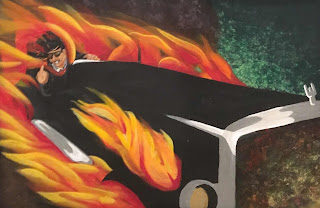
The final project was rendering the villain from a novel.   

Old Projects (1)

So I've met a few lower class-men who are somewhat frustrated with the projects that they're doing.  I felt the same way, and I felt that as the years progressed the projects became more creatively fulfilling.  I'm adding images of my old works to help show how the projects evolve in the illustration program at KU.

These pieces are from image making.


These are my examples of the bird, dog, fish project.  I chose fish.


Here are two examples of my person, object, setting project.


This example is my book cover of three randomly selected words.


This last image is a "map" of my daily routine to arrive at school.  The tonality of this piece is f*cking awful.

Saturday, December 13, 2014

Done

So I've finally finished my concept, all that's left is to print it out.  I ended up going though nearly a dozen different versions before settling on one that arguably works.

So the font that I wanted to use to introduce my "speaker" I found online and was miniscule. To scale it up to bigger than a few pixels tall was to re-draw the letters from scratch.  Sorry if it's a bit hard so see because of the transparent background.

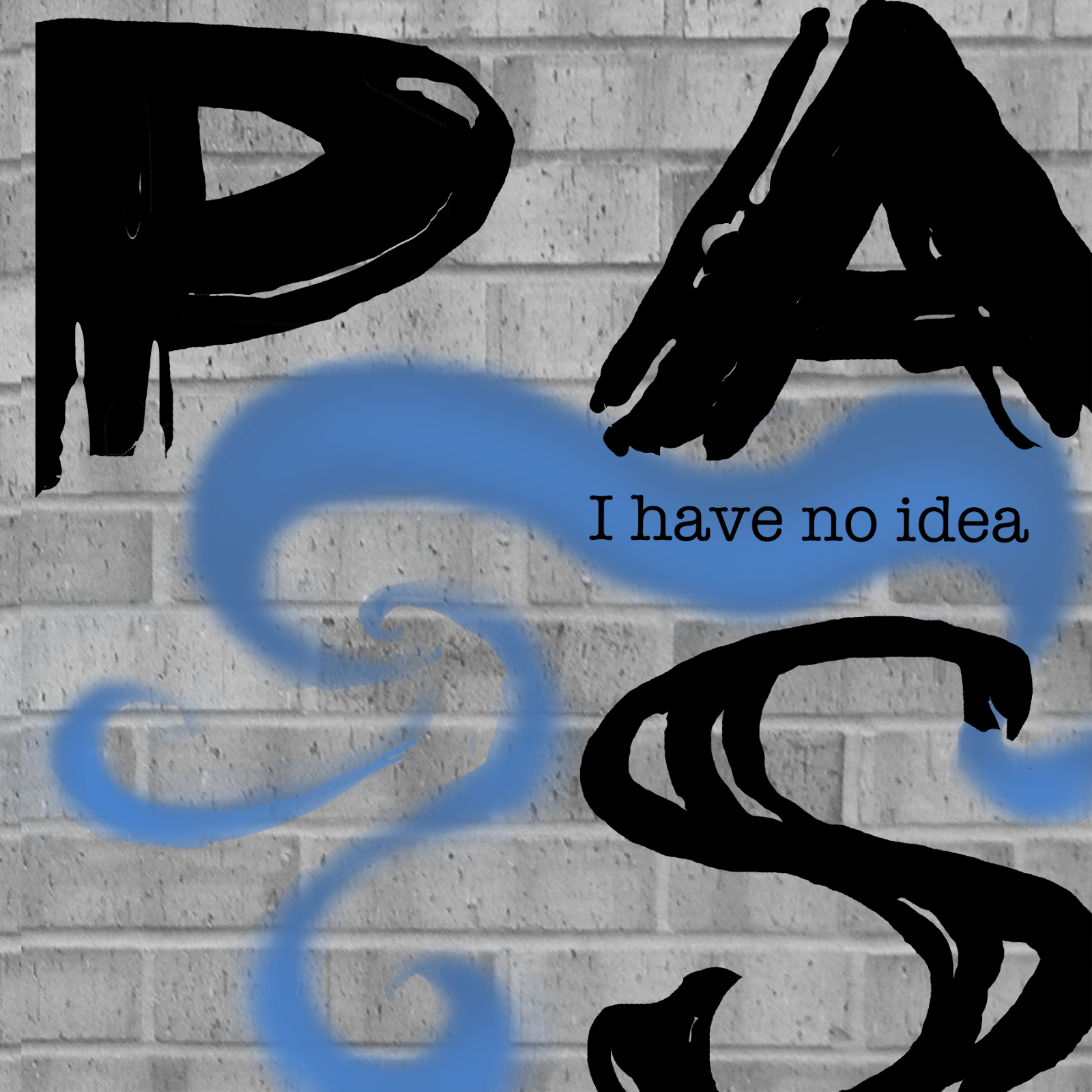
So after redrawing the font to a point I was happy with, I arranged them exactly how I intended from my earlier concept.  And I'm fairly happy with how the stark black and white signage looked, however I felt that exploring color couldn't hurt.

I attempted many backgrounds behind the letters.  The green-orange paint splatter looking one is actually an interesting texture concrete that I felt might be interesting.  Then I used the literal wall from the art & design building, simply a monochromatic version of it. But I could never get the lecture title legible enough against the background.

I also got super explorative with my digital drawing tablet, and started creating a flowing organic looking background that was a lot of fun to draw. But it was so super detailed I feared it was too interesting. Then I realized why not use the organic idea as a ribbon over the brick background.


So that was my final signage concept and all that was left was putting everything together. While putting the signs up I realized I could use the ribbon as "wind" so I added just a skoch of blue
 above the three signs to anchor everything together.


I thought it would be a good idea to attempt to show the idea from a slightly different angle, just to see if how it would look.
And lastly a legible, close up of the front on design photo. This project was a lot of fun for me personally. If I were to do it again, I might try a smaller idea.  I think I've got nearly 7 gb of work done for this project, and the files started to make the computer chug. Saving some of the files took 10 minutes or so to save.